Our web browsing experience has deteriorated over the past few months, as Taboola and a few other companies have tried and successfully convinced a large number of online publishers that they can help them monetise their online properties. Online publishers also modify their pages to ensure that maximise their page views. An article that should only be displayed in one page, gets divided into many many pages.
Don’t get me wrong, I understand that companies need to make money to survive and prosper, but I feel that ugly, sometimes disgusting ads from Taboola et al are either turning people away or forcing them to use ad blockers. I belong to the latter group. As a result of Taboola, I started using AdBlock (get extension for Chrome here).
To understand the difference in the web browsing experience, here are two shots from an article on Popular Mechanics.
With Ads: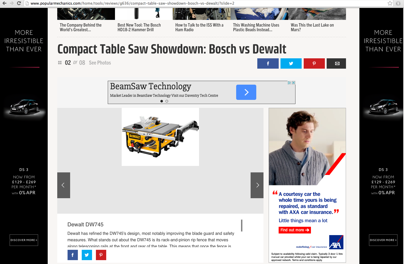
Without Ads: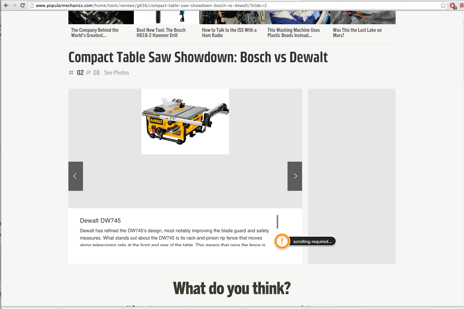
What really annoys me is the fact that the designers are happy to mess up the functionality of the site, in order to get more ad space. Notice the area near the orange exclamation mark. The user can barely read 3 lines of text here, even with the ads blocked. To read the rest of the text on this page, you need to scroll using the tiny scrollbar… If you try to scroll down using your fingers on the iPad, you click the ads…
The whole article, with its low-res photos should not be over one page long. Here it gets converted into 8 pages. Disgraceful.
Aggressive advertising techniques will turn users away. Short term gains will be offset by lasting long term losses in readership. It’s common sense.